DESIGN
Known for dreaming up colorful clothes imbued with exuberance and personality, the in-demand fashion designer shares how he translated his vision to a series of 12 paints and three wallpapers for the storied British brand.
BY JENNA ADRIAN-DIAZ
September 06, 2023
Credit: Robin Kitchin for Farrow & Ball
…
Since graduating from the Savannah College of Art and Design in 2016, Christopher John Rogers has taken the fashion world by storm. He’s racked up awards (Forbes 30 Under 30, Vogue Fashion Fund, CFDA Emerging Designer) and his eponymous line is stocked at Bergdorf Goodman, Saks Fifth Avenue, and Net-a-Porter. Year after year, his collections earn unanimously positive editor reviews because the clothes and the perspective behind them is just that good. What’s more, in an inherently exclusive industry preceded by a punishing reputation, he is unfailingly kind.
The avid following that has coalesced around Rogers in the wake of his talent and deserved success shows up well outside of the fall and spring seasons that envelop New York in street-styled mayhem every February and September. Since 2021, he has debuted new collections in May and December around the resort and pre-fall seasons and shows once a year outside of Fashion Week. While his approach to the fashion calendar has evolved over the years, so too has his ability to awe with an eye for color so distinct that a particular way of color blocking or certain shade of red-orange is attributable to him. It all makes the designer’s new collection of paints with Farrow & Ball seem downright cosmically ordained.
Credit: James Merrell
…
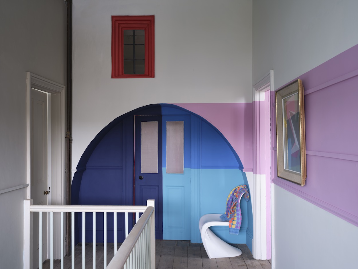
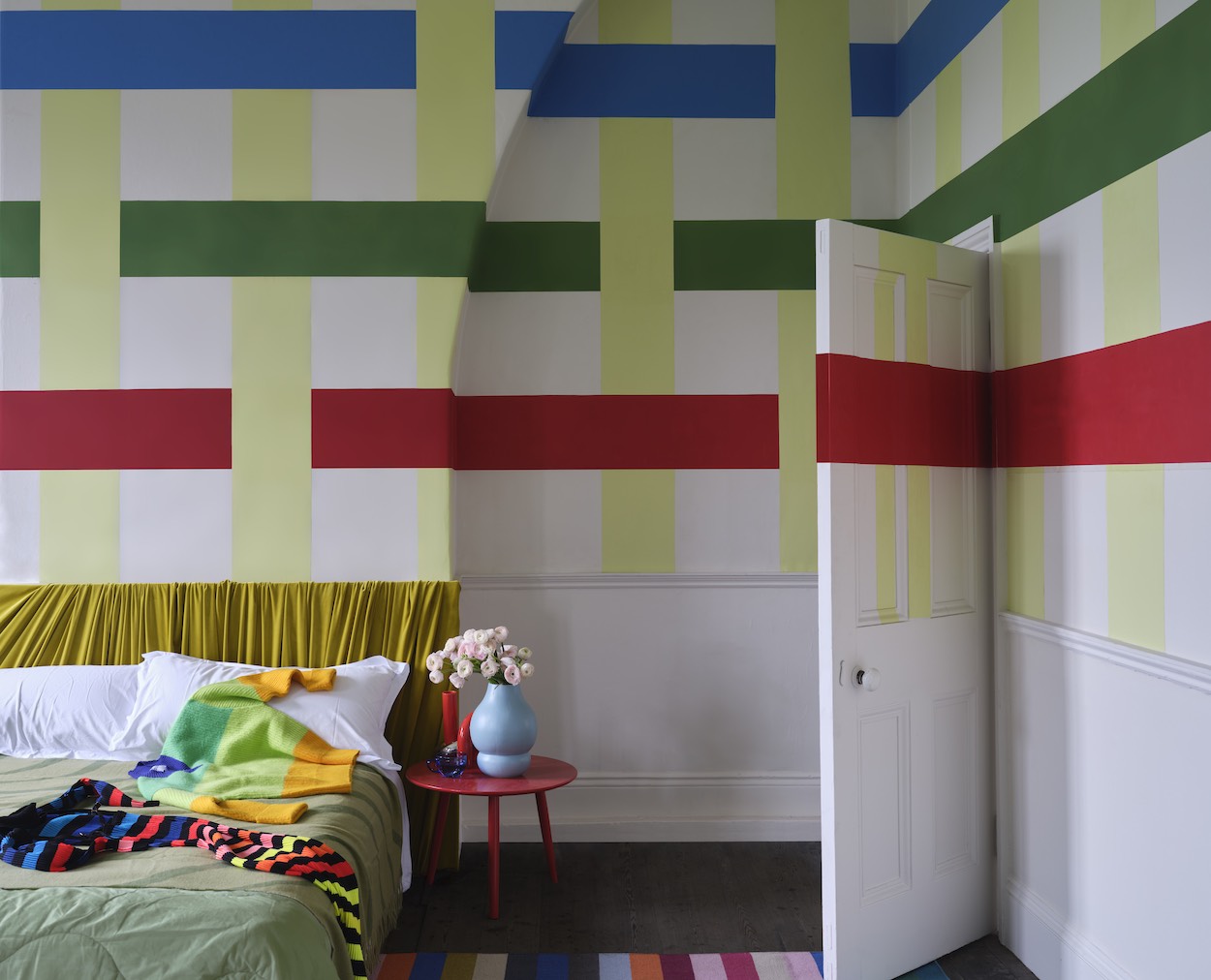
The Carte Blanche collection features 12 colors and three wallpapers that draw inspiration from memories spent with loved ones in Rogers’ home state of Louisiana. Ahead of the launch, Rogers joined Farrow & Ball creative director Charlotte Cosby in conversation with Surface to talk about the power of autonomy and play, colors that didn’t make the cut, and the pursuit of reinvention.
Chris, you recently told Vogue that both autonomy and the idea of play are “paramount” to what you do. With a name like Carte Blanche, do you see this collection as an extension of that philosophy?
CJR: When we started working on the collection together, I wanted there to be different options for people to find tools to express themselves however they wished. I’m not in the business of prescribing a formula to people. You can go as bold with print and color, or easy, with the neutrals. That breadth is reflected in the clothing I create, and also in this collection we’ve developed together.

Credit: James Merrell
…
You’ve also incorporated more neutrals into your fashion collections lately. Both you and Farrow & Ball are so well-known for your relationship to color—did you face any self-imposed pressure to play into that at all?
CJR: I knew that I wanted there to be a spectrum present at the end of the process; I wanted every color to be represented. I had that expectation for myself.
CC: It was interesting, though, because we were actually going to do eight colors. We were like, “This isn’t enough.” Because if, like Chris was saying before, you’re going be able to express yourself in whichever way you want, we realized we did need to add neutrals to bridge some of the extreme colors.
CJR: Even looking at the Farrow & Ball archives, there are so many beautiful, perfect shades. It was interesting to find the colors that I was after, but in new ways.
Credit: James Merrell
…
Can you give an example of how you did that?
CJR: One my favorite Farrow & Ball colors is Charlotte’s Locks. It’s an orangey red; I’m obsessed with it. That was like one of the colors I would have proposed. But [we went with] Romesco. It’s more red than Charlotte’s Locks. That’s just one example.
So Farrow & Ball’s pigments are legendary. They’re impossible to replicate through color-matching and can be difficult to work with in other ways too. Was that your experience at all?
CJR: One thing I found interesting was the way that we came up with Shallot. I sent over a shirting reference and there were black, ivory, blue, and red stripes throughout. There’s a machine that can find the median color within all of the hues present, and it was the pastel lavender color that made Shallot. And Hog Plum actually came out really well.
CC: Everyone is obsessed with Hog Plum.
CJR: That’s so funny to me, because I was like, “This is gonna be the most divisive.”

Charlotte Cosby and Christopher John Rogers. Credit: Robin Kitchin for Farrow & Ball
…
Was there a color or a wallpaper pattern you started on that didn’t work out?
CC: It’s that tobacco color for me. A yellowy brown that we just couldn’t get the right opacity on. Both Chris and I could have kept pushing the lab but we got to a point where we needed to move on. There are a couple of colors we had to do that with. It was so vibrant, and the more vibrant the colors are, the harder they are to get to the right opacity.
Way before this collaboration was even a pitch, what inspired you to learn more about Chris’s work?
CC: I saw Chris’s work on Instagram and the things you watch, they pop up more. I then started really looking at it. Balancing color is very, very difficult. Chris is able to balance multiple colors—there can be 12 colors on something of his and they all sing and they are so nuanced. I was like, “He gets it.” I could see that everything he did was of a level that meant he wouldn’t accept anything that wasn’t good enough.
Likewise, Chris, your DMs are probably blowing up with brands who want to work with you and there are so many trendy new paint startups. What drew you to Farrow & Ball?
CJR: Farrow & Ball is known for color and quality. Both of our brands have that in common. I want to be a brand that stands the test of time and is around for the next 25, 50 years. Working with a brand that has done it successfully and continues to reinvent itself in a modern way while keeping quality and timelessness at the center of what they do felt like a no-brainer to me.
Previous
Credit: Source link
